Uvod u R - Sesija07
Goran S. Milovanović, PhD
DataKolektiv, Data Scientist & Vlasnik![]()
Sesija 07: {ggplot2} i vizuelizacija podataka
Fidbek se upućuje na goran.milovanovic@datakolektiv.com. Ova sveščica prati kurs Uvod u R programiranje za analizu podataka 2020/21.
U Sesiji 07 bavimo se vizuelizacijom podataka u programskom jeziku R kroz {tidyverse} paket {ggplot2}.
0. Osnove: gramatika grafike u {ggplot2}
library(tidyverse)Podaci sa Interneta: Inside Airbnb:
file_url <-
  "http://data.insideairbnb.com/the-netherlands/north-holland/amsterdam/2022-01-06/visualisations/listings.csv"
listings <- read.csv(file_url,
                     header = TRUE,
                     check.names = FALSE,
                     stringsAsFactors = FALSE)
listings
Koji tipovi soba postoje u listings?
roomTypes <- as.data.frame(
  table(listings$room_type)
  )
colnames(roomTypes) <- c('room_type', 'count')
roomTypes
Hajde da to vizuelizujemo:
ggplot(data = roomTypes,
       aes(x = room_type,
           y = count)
       ) +
  geom_bar(stat = 'identity', fill = "cadetblue3") +
  xlab('Room type') +
  ylab('Count') +
  ggtitle('Room type distribution in Airbnb Listings') +
  theme_bw() +
  theme(panel.border = element_blank())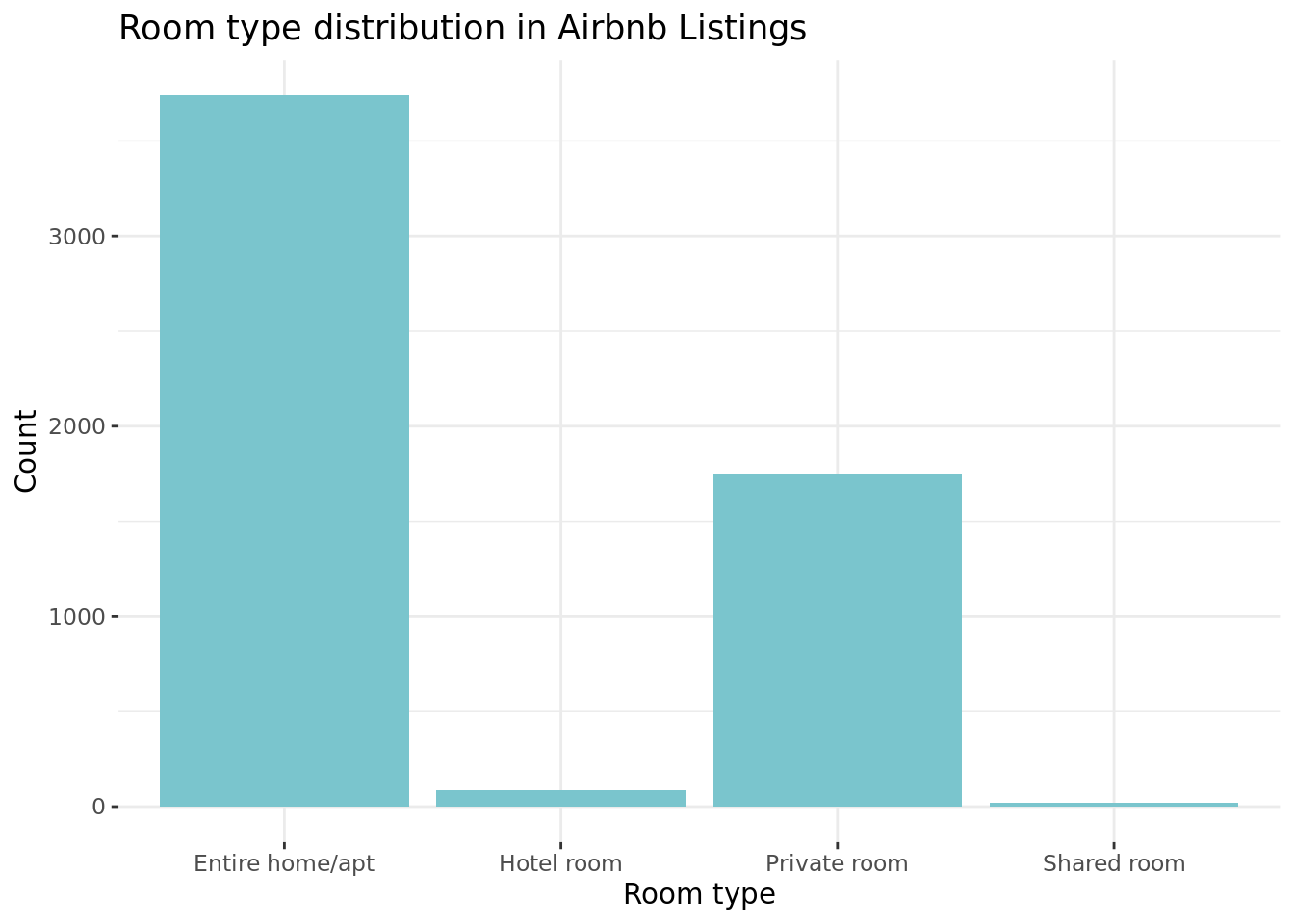
Idemo korak po korak da vidimo kako je izgrađena struktura ovog grafikona.
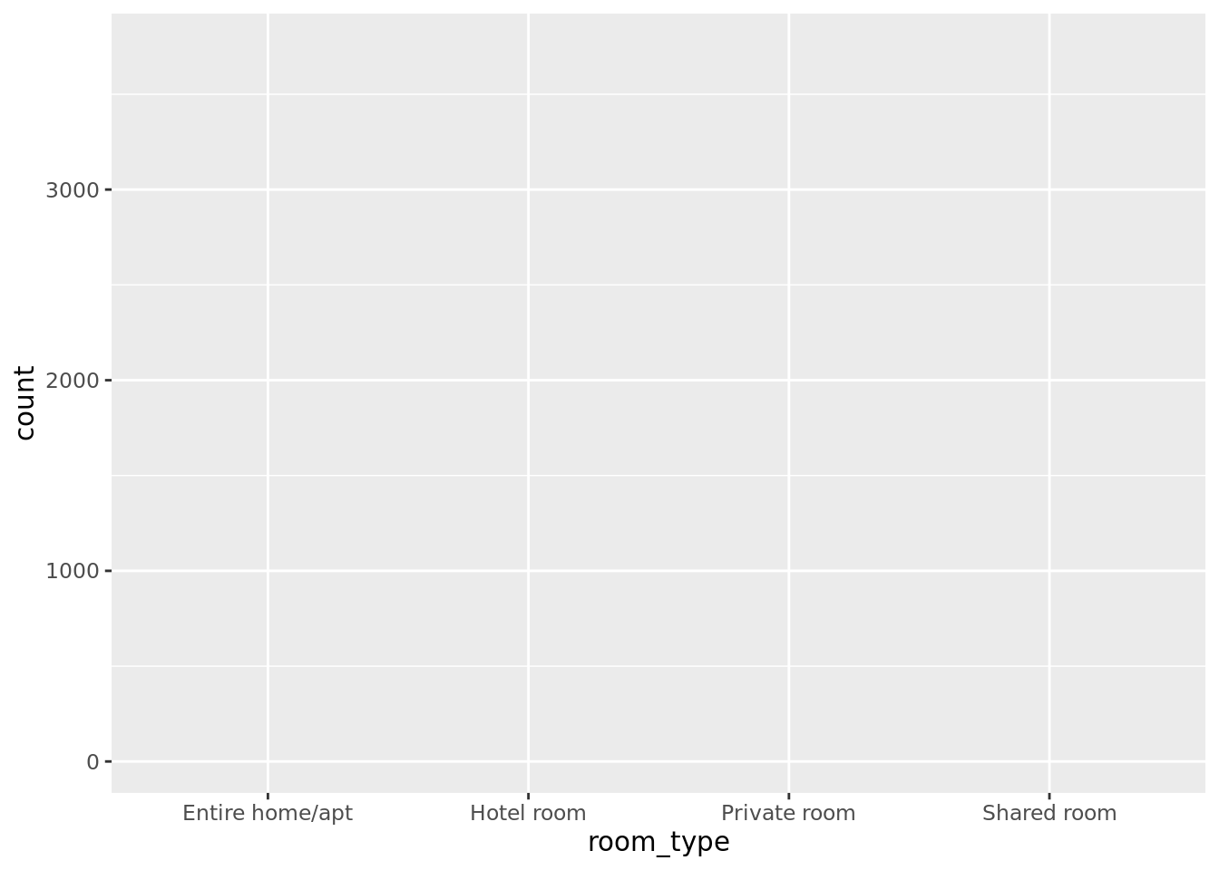
Prvo, bez upotrebe geoma, dobijamo samo “plan” grafike: {ggplot2} prepoznaje koje varijable koristimo i koje su, okvirno, njihove skale; mapira ih na horizontalnu i vertikalnu osu.
ggplot(data = roomTypes,
       aes(x = room_type,
           y = count)
       )
Geomi su oni što {ggplot2} omogućava da razume kako želimo nešto da vizuelizuju. Geomi su njegovi “glagoli”, “predikati”, i imaju jasno određenu semantiku: hoćemo bar plot, ili hoćemo tačke, ili linije, etc.
ggplot(data = roomTypes,
       aes(x = room_type, y = count)) +
  geom_bar(stat = 'identity',
           color = "black",
           fill = "darkred")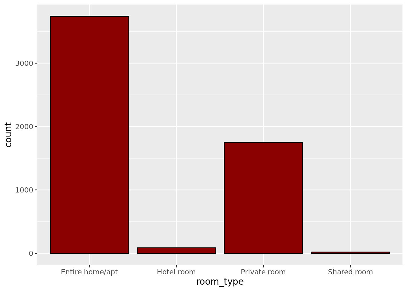
Dodajemo naslov sa ggtitle() funkcijom:
ggplot(data = roomTypes,
       aes(x = room_type, y = count)) +
  geom_bar(stat = 'identity', fill = "cadetblue3") +
  xlab('Room type') +
  ylab('Count') +
  ggtitle('Room type distribution in Airbnb Listings')
U trećem koraku koristimo funkciju theme() kako bismo doterali precizno elemente grafikona: dok geomi opisuju kako hoćemo da predstavimo podatke, u theme() se bavimo više estetikom i ergonomijom.
ggplot(data = roomTypes,
       aes(x = room_type, y = count)) +
  geom_bar(stat = 'identity', fill = "cadetblue3") +
  xlab('Room type') +
  ylab('Count') +
  ggtitle('Room type distribution in Airbnb Listings') +
  theme_bw()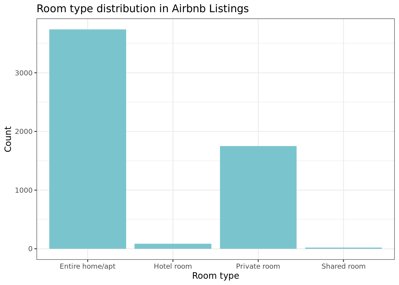
I doterujemo još, centrirajući naslov sa theme():
ggplot(data = roomTypes,
       aes(x = room_type, y = count)) +
  geom_bar(stat = 'identity', fill = "cadetblue3") +
  xlab('Room type') +
  ylab('Count') +
  ggtitle('Room type distribution in Airbnb Listings') +
  theme_bw() +
  theme(panel.border = element_blank()) +
  theme(plot.title = element_text(hjust = 0.5))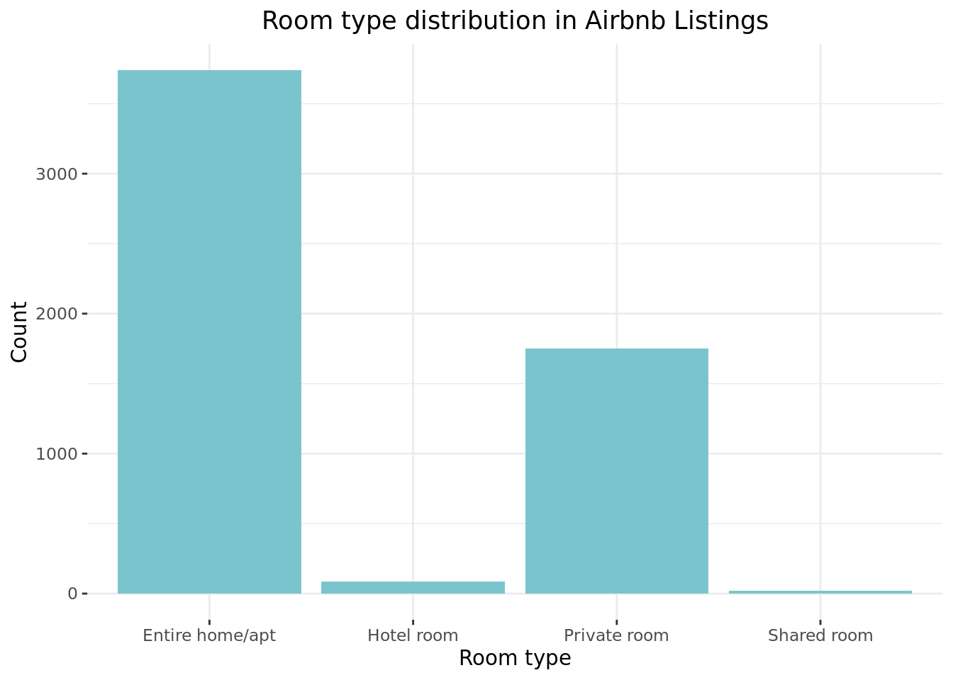
Da biste naučili upotrebu theme() - što je na ivici nemogućeg jer kroz nju kontrolišemo baš sve zamislive elemente neke {ggplot2} vizuelizacije - obratite pažnju na ovaj pregled njene sintakse: Modify components of a theme.
ggplot(data = roomTypes,
       aes(x = room_type, y = count)) +
  geom_bar(stat = 'identity', fill = "cadetblue3") +
  xlab('Room type') +
  ylab('Count') +
  ggtitle('Room type distribution in Airbnb Listings') +
  theme_bw() +
  theme(panel.border = element_blank()) +
  theme(plot.title = element_text(hjust = 0.5)) +
  theme(axis.text.x = element_text(size = 13))
ggplot(data = roomTypes,
       aes(x = room_type, y = count)) +
  geom_bar(stat = 'identity', fill = "cadetblue3") +
  xlab('Room type') +
  ylab('Count') +
  ggtitle('Room type distribution in Airbnb Listings') +
  theme_bw() +
  theme(panel.border = element_blank()) +
  theme(plot.title = element_text(hjust = 0.5)) +
  theme(axis.text.x = element_text(size = 13)) +
  theme(axis.title.x = element_text(size = 20))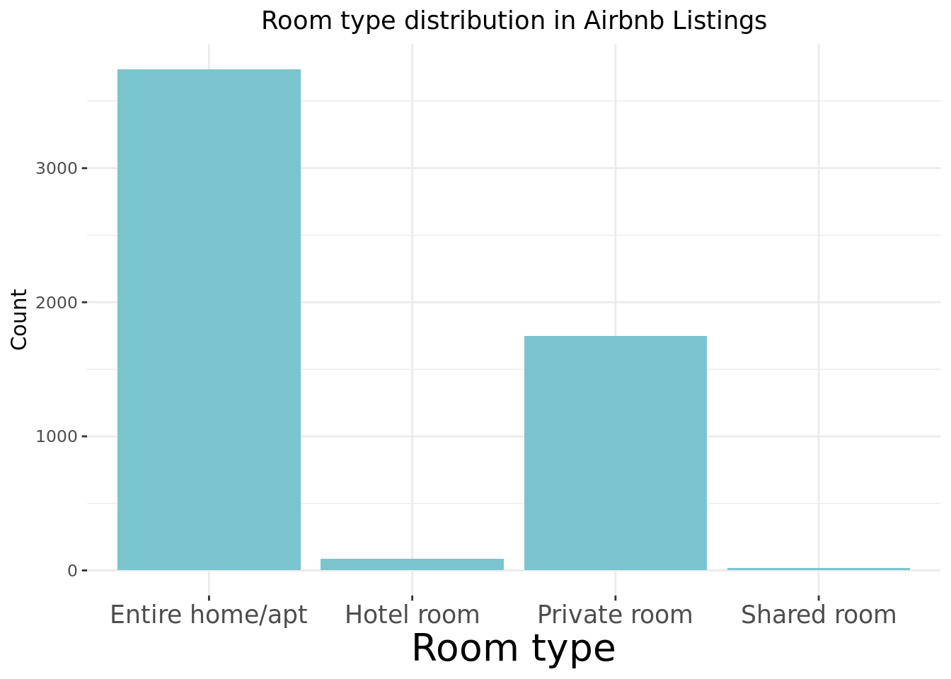
1. Primeri nekih često korišćenih tipova vizuelizacija podataka u {ggplot2}
I možemo da pravimo i komplikovanije stvari onda, npr. da vizuelizujemo više uslovnih distribucija verovatnoće:
ggplot(data = listings,
       aes(x = log(price),
           fill = room_type)) +
  geom_density(alpha = .15, color = "black") +
  ggtitle("Price vs Reviews per Month, per Room Type") +
  xlab('log(Price)') +
  ylab('Density') +
  theme_bw() +
  theme(panel.border = element_blank())
## Warning: Removed 7 rows containing non-finite values (stat_density).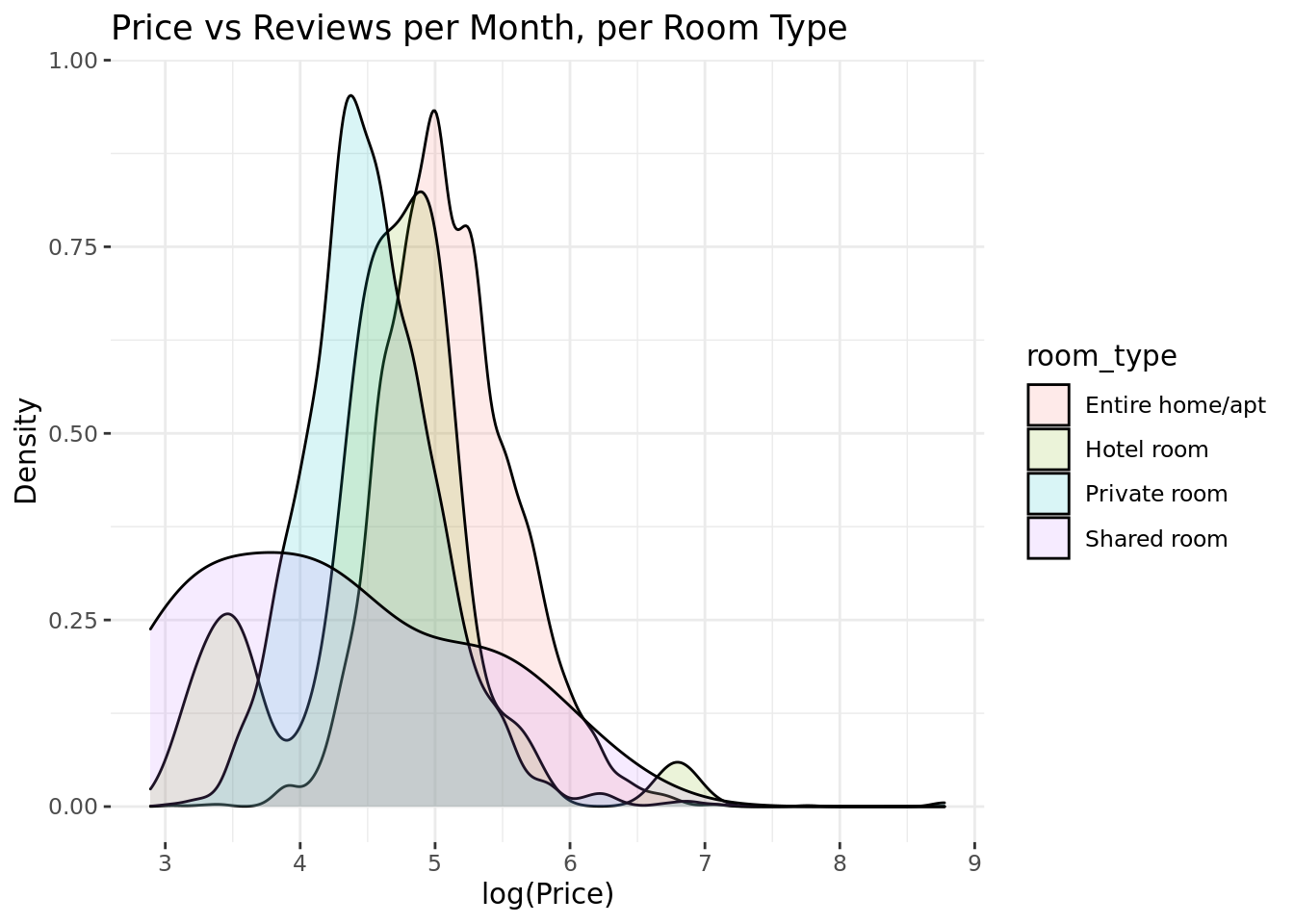
Skatergram sa optimalnom linearnom regresionom funkcijom:
ggplot(data = iris, aes(x = Sepal.Length,
                        y = Petal.Length)
       ) +
  geom_point() +
  geom_smooth(method = "lm", se = F, size = .25) +
  theme_bw() +
  theme(panel.border = element_blank())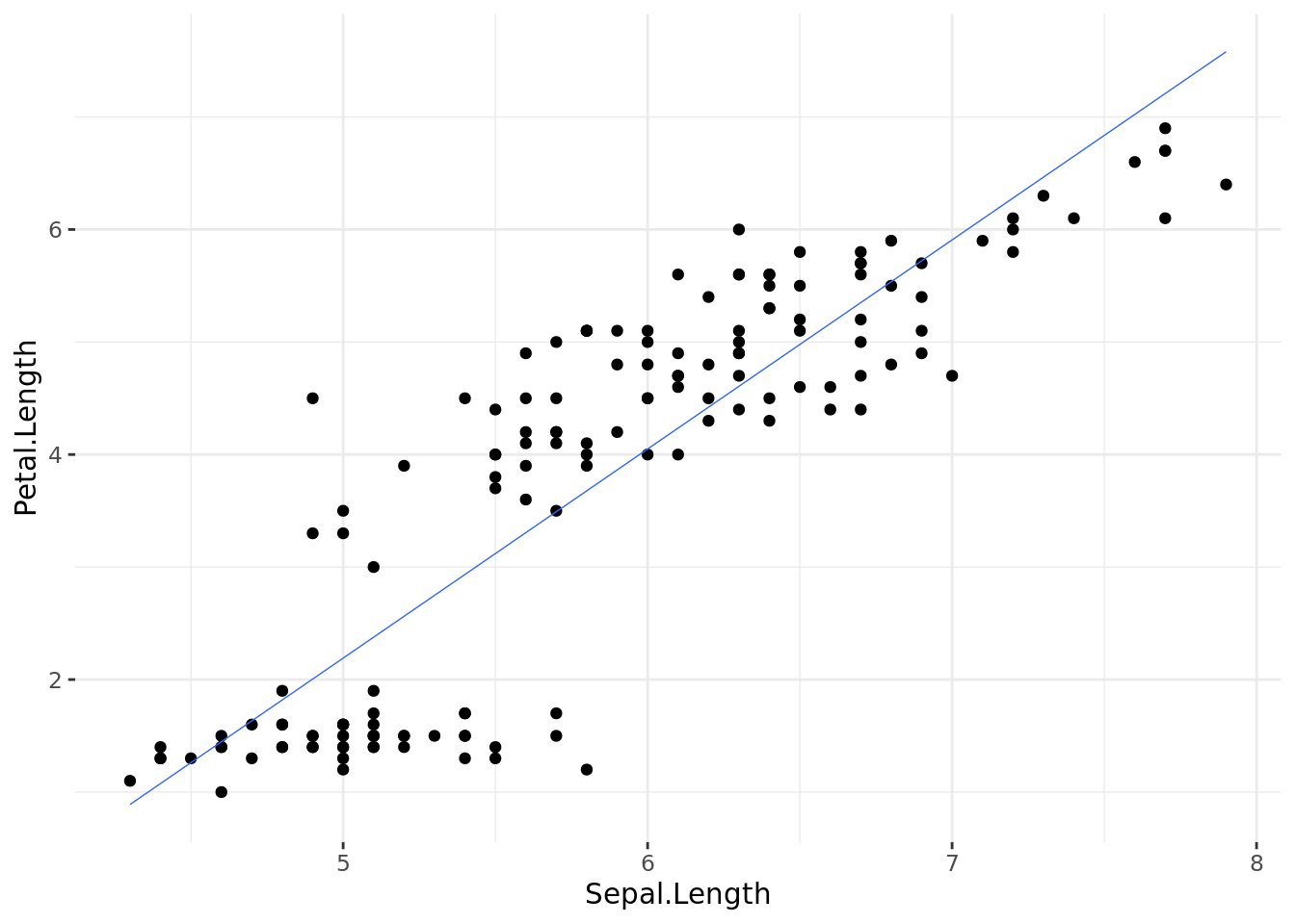
Skatergram po grupama kategrijalne varijable sa optimalnoim linearnim regresionom funkcijama po grupama:
ggplot(data = iris, aes(x = Sepal.Length,
                        y = Petal.Length,
                        color = Species)
       ) +
  geom_point() +
  geom_smooth(method = "lm", se = F, size = .25) +
  theme_bw() +
  theme(panel.border = element_blank())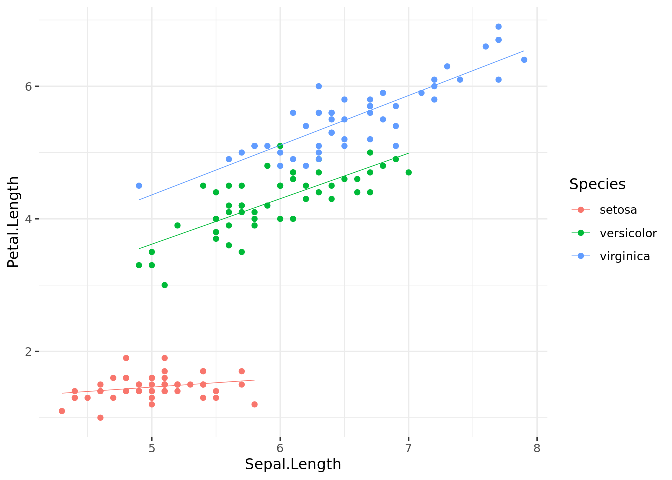
Plot sa više panela:
ggplot(data = iris, aes(x = Sepal.Length,
                        y = Petal.Length,
                        color = Species)
       ) +
  geom_point() +
  geom_smooth(method = "lm", se = F, size = .25) +
  facet_wrap(~Species) +
  theme_bw() +
  theme(panel.border = element_blank()) +
  theme(legend.position = "top")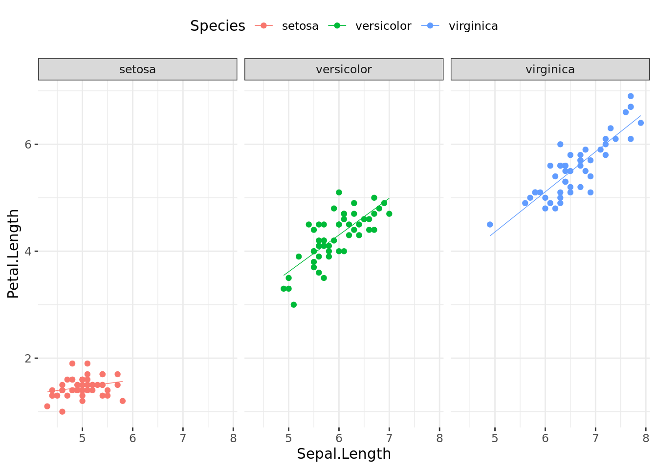
R Markdown
R Markdown je ono što koristimo da bismo razvili ove sveščice. Evo knjige iz koje se može naučiti rad u toj jednostavnoj ekstenziji R: R Markdown: The Definitive Guide, Yihui Xie, J. J. Allaire, Garrett Grolemunds..
![]()
Goran S. Milovanović, Data Scientist & Vlasnik, DataKolektiv.
Kontakt: goran.milovanovic@datakolektiv.com. Ovo je besplatan i slobodan softver: GPL v2.0.
